
You are currently browsing the tag archive for the ‘Unicorn Graphics’ tag.

The Psychedelic Furs song “The Ghost in You” starts playing in my ears as I’m walking along, and suddenly I’m thinking about typesetting. Go figure. But there is a reason for it.
I’ve worked in the magazine industry for a long time. Maybe not long when compared to the lifespan of a sequoia or a whale shark, but a good stretch in human years. When the Furs’ released Mirror Moves, the album with “The Ghost in You,” in 1984—approaching 40 years ago—I was already a magazine guy, eking out a living as editor of a little entertainment publication in the Boston area. That was my first full-time magazine job, if you don’t count my short stint at the Hollywood Reporter, and we did things a little differently then. Today anyone can be his or her own typesetter or even publisher. But back in the sepia-toned year of 1984 it wasn’t that easy. If you wanted to set words in type, you needed a professional.
Here’s how that worked. First, writers had to get me copy—words usually typed out on paper on a manual typewriter. Since this was before email, I often met the ink-stained wretches in person someplace in Boston—perhaps in front of the Rat in Kenmore Square—to get their copy so I could bring it back to my home office for editing.
I distinctly remember the first time I felt like I had a knack for this editing thing. I was working on an article about a few local bands. The writer was good, but his piece seemed too long, and it kind of bobbed and weaved all over the place. It didn’t flow the way I felt it should. I got out my pencil, scissors, and tape and started reshaping. I started by marking up the typed article with pencil, but that wasn’t enough. So I cut the manuscript into pieces and taped them back together the way I thought they should go. It was like the William S. Burroughs cut-and-paste technique in reverse, since I was trying to create structure, not tear it down. If I needed any new transitions, I typed them up on my typewriter and taped them into place. When I was done, I thought my Frankenstein monster of an edit read pretty well.
In fact, when the piece appeared in print, the writer complimented me on what a fine job I had done with his copy. Believe me, that’s rare. And when it does happen, it’s the good writers who thank you. The bad writers complain about how you’ve manhandled their exquisite prose and cut all the fine phrases that had pleased them the most. I even had one writer tell me I had taken out all his “cinnamon” and replaced it with “vanilla.” “Thanks for proving my point,” I should have said but didn’t, because I edited my response. What I said instead was, “Fuck you.”*
Once done with my editing, I would jump into my faithful 1975 Toyota Celica to bring the copy to Typo Tech.
That was our typesetter. The women who worked there—and it was mostly women, I recall, one of whom told me she owned an ocelot—would then type up the edited copy and print it out as long paper galleys, which I would dutifully retrieve, edit, and return for final type. This arrived as sturdy, slick galleys we called repro (because, I guess, it was suitable for reproduction in print). The magazine designer—who was also the magazine publisher until we briefly hired a freelancer—cut up the galleys, ran them through a waxer, and pasted the waxed repro down onto boards, along with the illustrations, to design the magazine. The printer would photograph the completed boards and make plates for the printing press. Yes, kids, that’s the way we did it back then.
Primitive, right?
Not as primitive as it was in Benjamin Franklin’s day. In my very first book, Ben Franklin’s Philadelphia, I discuss the Founding Father’s job as a printer. This is what I said:
The work of a printer was tedious and tiresome. He had to compose his type letter by letter, setting them up backward and upside down, and to do so as quickly and efficiently as possible. The broadsheet of the Declaration of Independence required three or four hours of composing work. Franklin recalled one time when he spilled his type after spending hours composing pages. He had to work through the night redoing it but saw the silver lining in the incident, as his neighbors noted his extraordinary work habits, and word of his industry and dedication began to spread.
After setting the type, the printer next applied ink with a device called an inking ball. Made from tree sap, linseed oil, and lamp black, black ink was a sticky substance that adhered well to the metal type. The printer applied the ink to the paper by turning a long handle that pressed the paper to the type. He had to repeat the process—inking the type, putting in the paper, and making the impression—for each page, and then he had to set the type for the next page, and the next.
The printing industry has changed tremendously since Franklin’s day, but we still use the same terminology. We talk about the press, although its definition has expanded to include television news as well as printed media. Printers kept their capital letters separate in an upper case, giving us the terms for upper- and lower-case letters. Printers minded their “p’s and q’s,” since they looked similar, and a disgruntled printer might be “out of sorts,” the sorts being his metal type, which eventually wore out and had to be replaced.
That was when an “ink-stained wretch” could actually be stained with ink.
Weren’t we going to talk about “The Ghost in You” from the Psychedelic Furs’ Mirror Moves album? I think we were.
One of the perks of the job at the rock magazine was that I got promotional copies of new albums. I had to hand off most of the good ones to my reviewers, but before doing that I copied them onto cassette tapes. I did that with Mirror Moves. On the other side, I taped ABC’s much-maligned second album, Beauty Stab. I listened to that cassette a lot back in 1984 and 1985 as I was driving my Celica on the roundtrip trip across the Charles River to deliver magazine copy to Typo Tech in Cambridge. And that’s why “The Ghost in You” made me muse about typesetting.
Later I left Boston for a job at a national magazine in Washington, D.C. Our typesetting company there was called Unicorn Graphics and my customer rep was a very polite man named Steve. Perhaps he realized I was slightly over my head serving as managing editor of a big national magazine, because he could be very diplomatic when he sensed I didn’t understand something. “Here’s the thing,” he would begin as he gently guided me away from error.
Instead of taking copy to the typesetter myself, I now enjoyed the luxury of calling a messenger service—Fleet Feet—to deliver the goods. (This was a time when you would see bicycle messengers weaving through traffic all over the city. On Fridays, huge flocks of these spandex-clad creatures would meet after hours in Dupont Circle. I assume that modern communications technology has made the bicycle messenger an endangered species, if not outright extinct.) After Unicorn’s people set our copy, they would Fleet Feet galleys and then repro back to me. The art director would still have to wax the repro and paste it down on boards. I was impressed by his skill with an X-Acto knife. If we needed to make changes after the pages were already laid out, he would swiftly cut up the pasted-down repro—eliminating a word here, a phrase there, rebuilding the sentences on the page, gently inserting tiny scraps of galleys with periods or commas, and making it all fit. On one occasion, though, that led to disaster. Somehow one of the reconstructed sentences fell off the board between our office and the printer, and I didn’t notice the missing words until I got the printed magazine. Oops.
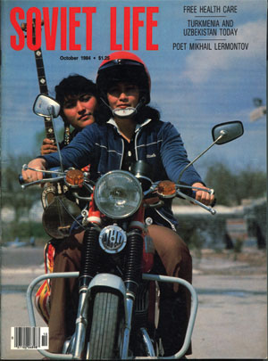
Unicorn Graphics handled a lot of magazines, including Soviet Life, a propaganda publication put out by the USSR. This was the 1980s, the Soviet Union still existed, and Soviet Life featured lots of stories about the wonders of life under Communism, with pictures of rippling wheat fields and proletariat tractors. I remember one year at Unicorn Graphics’ annual Christmas party when the managing editor of Soviet Life struck up a conversation with me at the buffet table. Later, Steve took me aside. “Here’s the thing,” he said, and he told me that the Russian worked for Soviet intelligence and sometimes tried to recruit Americans. He advised me to be careful talking to him. So, I guess I can thank Steve for keeping me from becoming the magazine industry’s equivalent of Aldrich Ames, spilling all the secrets of American publishing to the Russians.
The Soviet Union wasn’t the only entity to experience change since then. I did, too. While working in Washington I began to use a high-tech thing called a word processor. I had received my first inkling of these things a few years before, when I read an interview with former President Jimmy Carter in Newsweek. The ex-president was working on his memoirs with a computer that let him move blocks of text around his manuscript and rewrite things without having to use paper, scissors, tape or even typewriters. “Wow,” I thought. “That sounds . . . complicated.” I felt glad I would never have to use such a complex device myself.
By the time I reached that national magazine I was using a word processor, on a bulky IBM PC with two floppy drives. We got an upgrade in our typesetting operations with the addition of another PC that we used to send our copy to Unicorn Graphics via a telephone line. First, though, we had to add codes to our copy to set column width, font size, and that kind of thing. Then we inserted the floppy disk into the typesetting IBM to h ‘n’ j. That meant “hyphenate and justify.” We’d transmit the text to Unicorn Graphics’ computers (via a dial-up modem), wait a minute or two, and then “fetch” it back. It wasn’t yet a galley—we would still have to print out copy on a dot-matrix printer—make any final edits, and then send the final version to Unicorn and have it printed out as galleys.
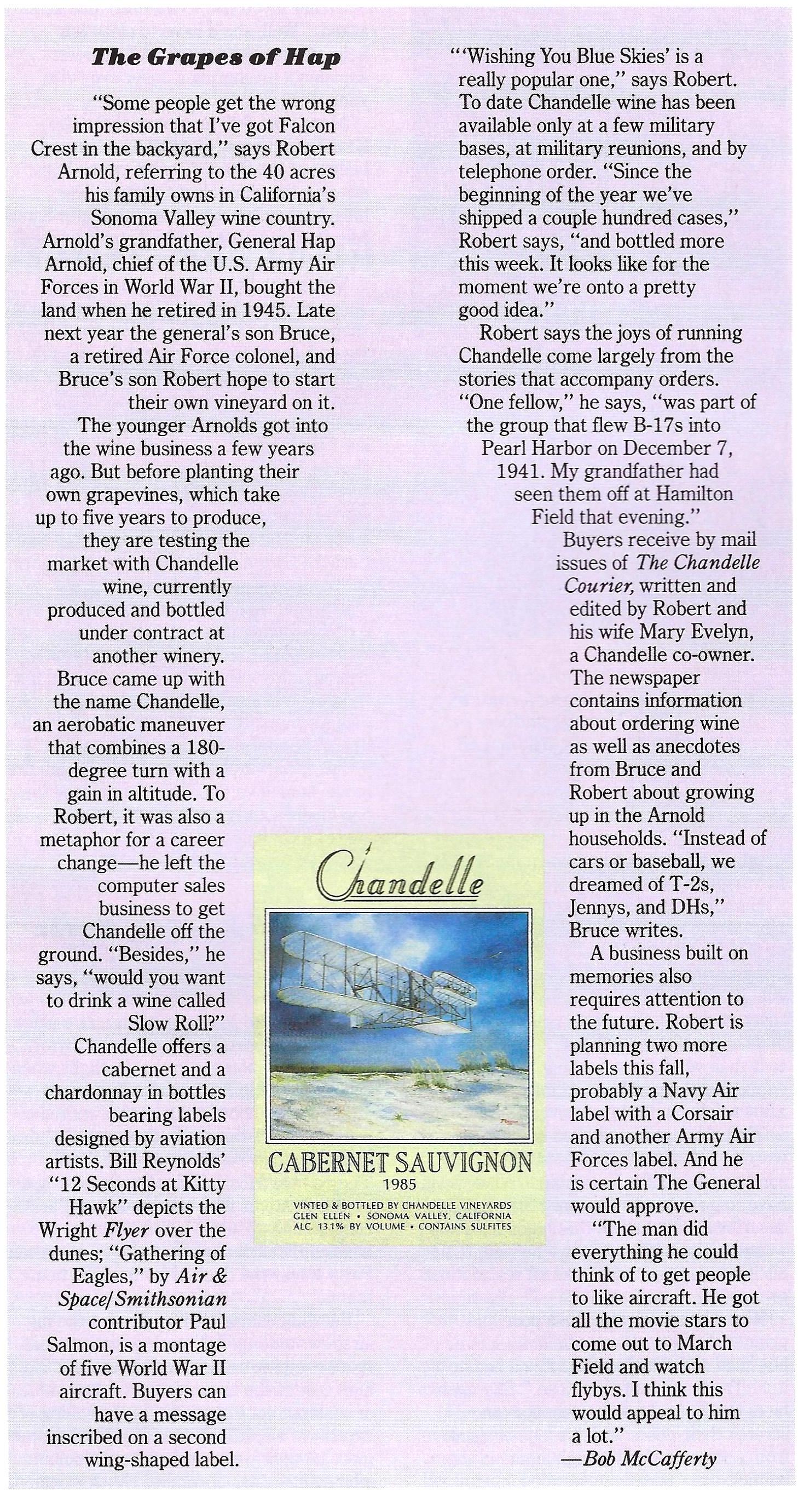
In effect, editors had become typesetters. I still recall with pride one of my early h ‘n’ j triumphs, when I decided I wanted the text for a short item about an airplane-themed wine to appear in the shape of a wine bottle. That meant taking a ruler, measuring how much to indent every single line of the text, and then coding each line individually. It didn’t quite work out the first time, or maybe the second, or perhaps even the third, but we finally got galleys back in a near perfect bottle shape. Sometimes it’s the little things that give you the most pleasure.
That was when I was working at a Washington-based aerospace magazine. That magazine sent me to Denver for a week to train on the Quark Publishing System. Quark was the dominant page layout software at the time, and QPS was a publishing “suite” that allowed text editors to interface with the page layout and get a real-time sense of what the pages would look like. (They called that view WYSIWYG, pronounced “whizzy wig.” It meant “what you see is what you get.”) QPS was complex and sometimes sulky software—we used Apple computers and I got more than my share of the dreaded “bomb” on my screen when the computer and the software got into a duel of wills—but was it also kind of cool.
There’s been a lot of ink under the bridge since then. The magazine industry has certainly changed. PDFs have replaced paper galleys and designers lay out pages on computers, not boards. I’ve changed, too. I’ve had some magazines shot out from under me, and I’ve been shot out of some magazines. That fact that I still work for an ink-on-paper print publication is something of a miracle, though. Let’s see how long that lasts.
Oh, yeah. “The Ghost in You.” It’s a hell of a song.
*Okay, okay. Not really. But I thought it.
